
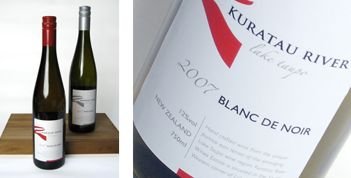


Location is so important in the wine industry. This label derives its distinctive logo shape from the curves of the Kuratau river on which the winery encroaches.
The understated typography is purposely classical with sans serif typefaces lending a subtle modern note to the final design.